[Case 01]
Enhancing user ratings by 32% through simplified UX
Fintech
Apollo | Mobile banking app redesign
Streamlining financial access in Ethiopia through human-centered design
[Project Overview]
Apollo is a mobile banking app serving users across Ethiopia. Despite its essential features, it suffered from confusing navigation and poor trust, driving low app ratings and high customer support demand.
I led the end-to-end UX redesign, focusing on simplifying key flows, increasing user satisfaction, and ensuring users could easily complete core tasks.
[Industry]
Fintech
[My Role]
Lead Designer
[Platforms]
IOS and Android
[Timeline]
January 2025- March 2025
[Problem Statement]
Apollo had a cluttered UI, confusing flows, hidden features that reduced trust and made tasks like money transfers and loan request frustrating. This led to low ratings and poor user retention.
[Outcome]
I successfully redesigned the app's interface and overall flow and experience using the double diamond approach.
[Before]
[After]
[Persona]

Hanna Belay
Graphic Designer
Age: 29
Location: Addis Ababa
Tech Proficiency: High
Gender: Female
[Goal]
Quickly complete transfers and bill payments
Find intuitive flows to complete tasks
Request payment from clients for her works
[Frustrations]
Low trust in the app’s design
Struggles to find key features and gets lost in menus
Completing a transfer feels unnecessarily complex, with too many screens
Over the span of 12 weeks, I carried out the complete redesign of the application starting from research and discovery to uncover the patterns and roots of basic user pain points to problem definition to wireframe and design to finally prototype and usability testing.
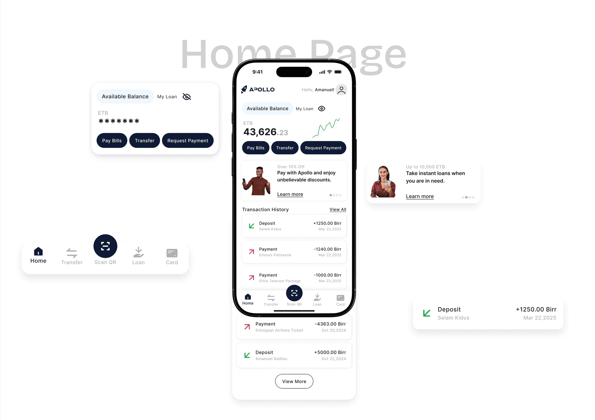
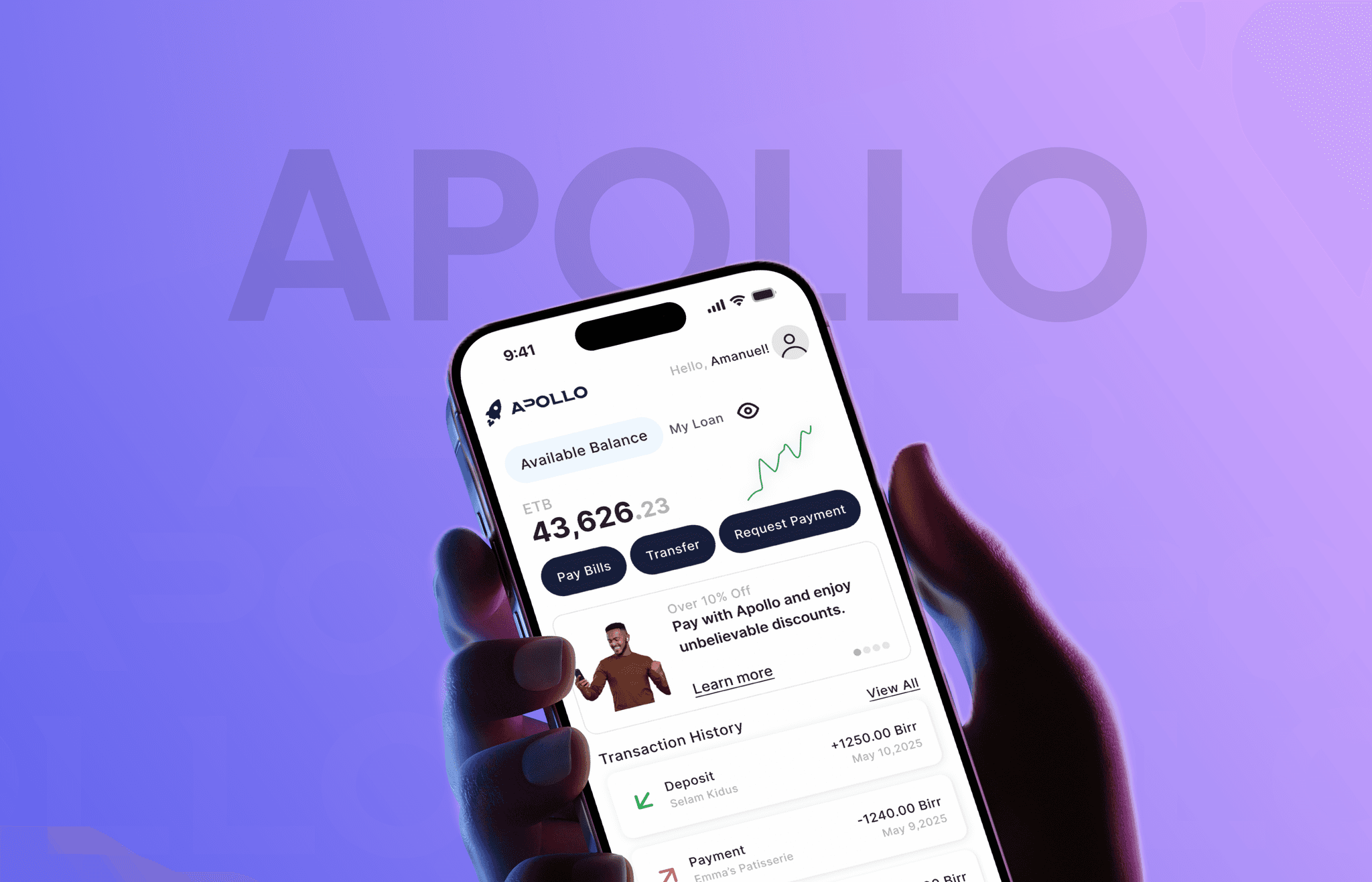
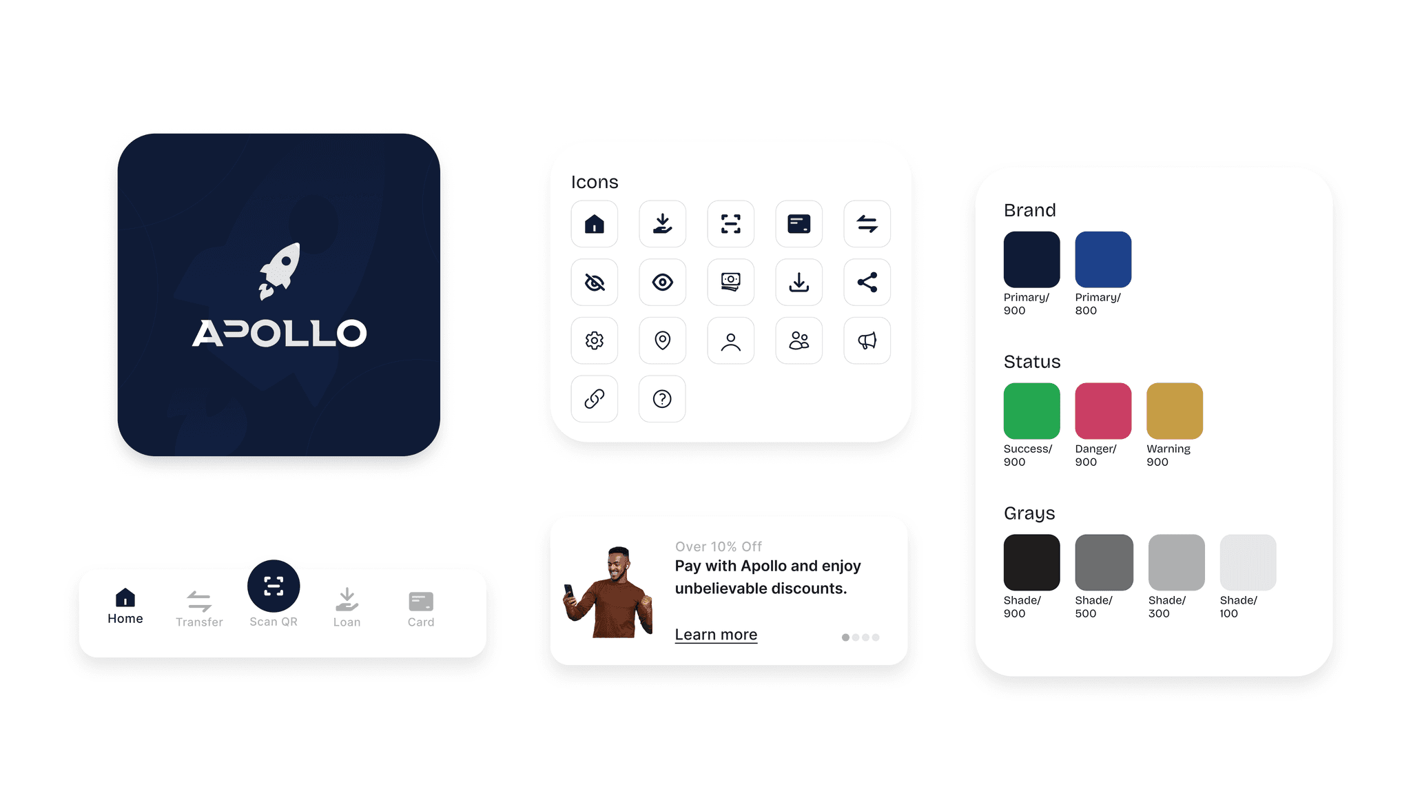
Updated Homepage
70% of users (survey respondents) responded that they don't find the main features of the application from the homepage. After the redesign the 6 most used features of the application could be found from the homepage.
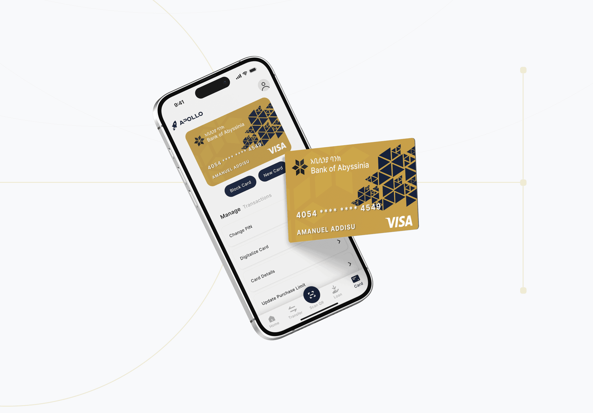
Enhanced Card Managment
What do you want to do with your card? See transactions? Block it if it is stolen? Request a new card? Manage it? It can all be found from the card management page.
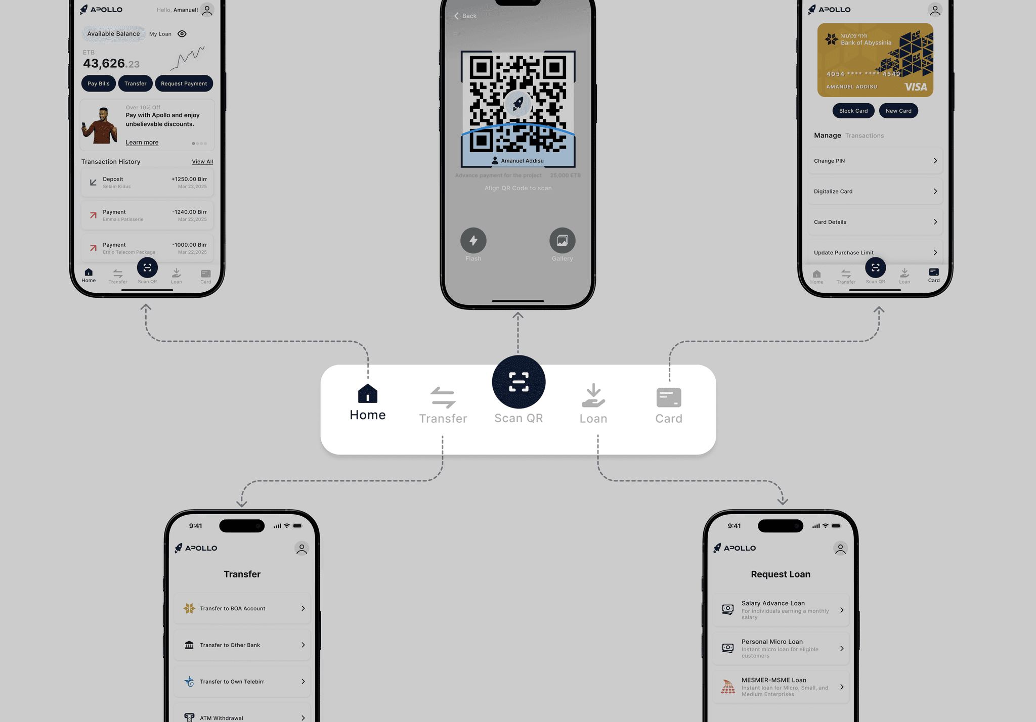
Optimized navigation and I.A
56% of users say they are always confused to find the right bill payment page as there were two separate bill payment pages.
I conducted 10 (2 in-person and 8 online interviews through video conferencing) and sent out a survey to 50 active apollo users which helped me collect quantitative data.
The 6 most used features of the application were as follows:
Pay bills (100%)
Scan QR & Pay (94%)
Transfer Money (90%)
Request Money (90%)
Card Management (90%)
Request Loan (76%)
70%
of users said they couldn't find the features they used the most easily from the current homepage.
"The interface is messy and unintuitive I can't even find the features I signed up for"
56%
of users said they struggled with bill payments
'I always get confused to which bill payment page I should go to pay my Wi-Fi bill'
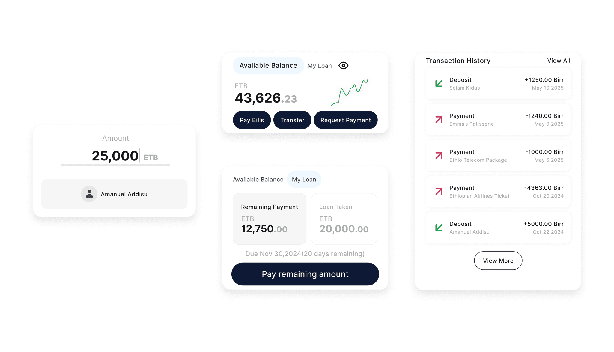
76%
of users said they would like to see the loan requesting page easily and also see the status of their loan including the due date and amount of payment remaining.

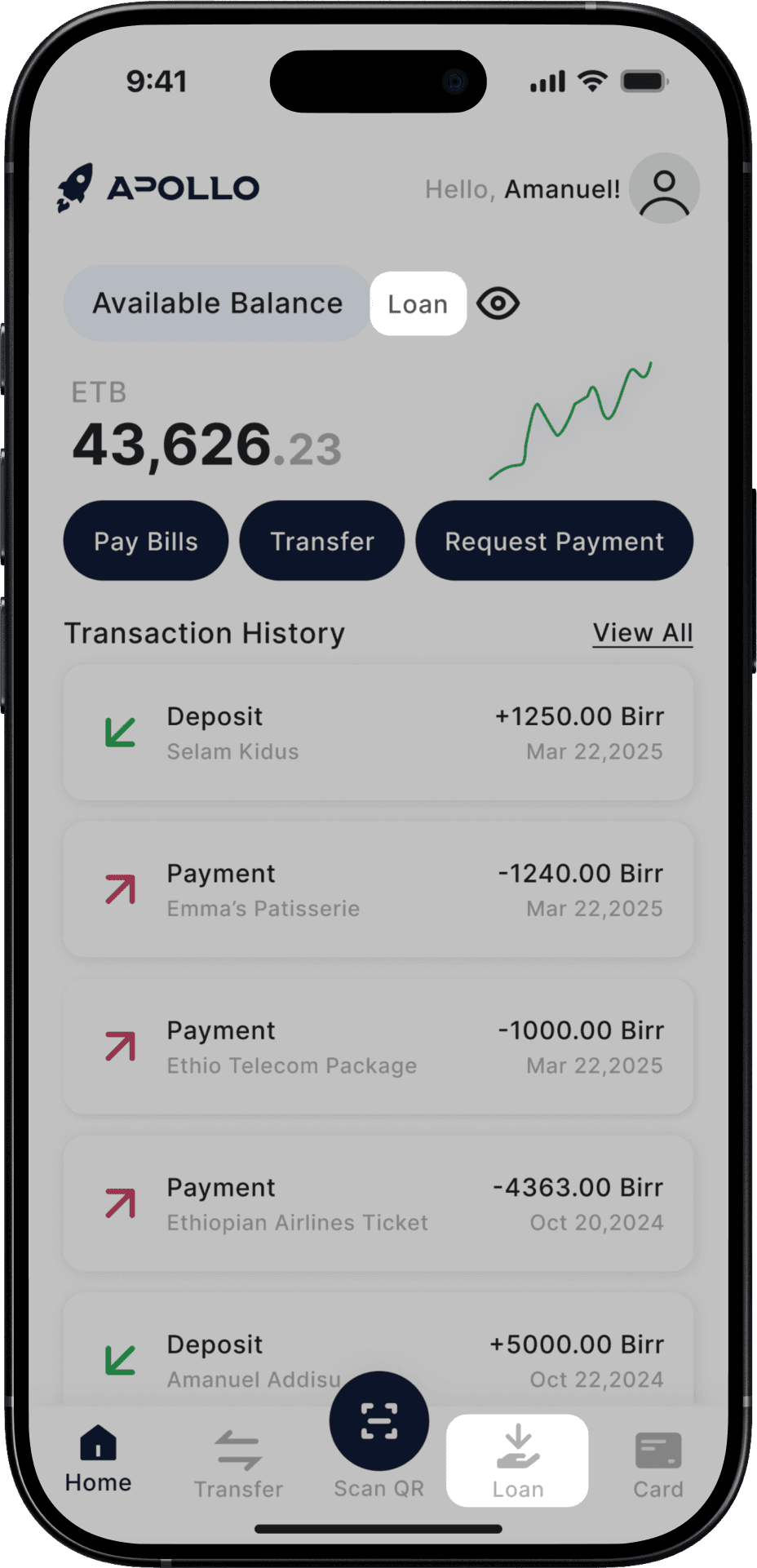
Before
The two “Loan” buttons were confusing to some users as they had the same label but belonged to different pages.
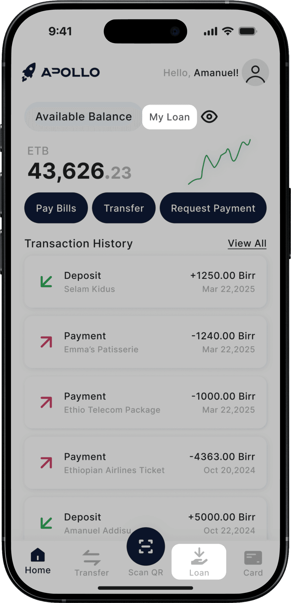
After
Updated the first button to “My Loans” to avoid the confusion faced by testers
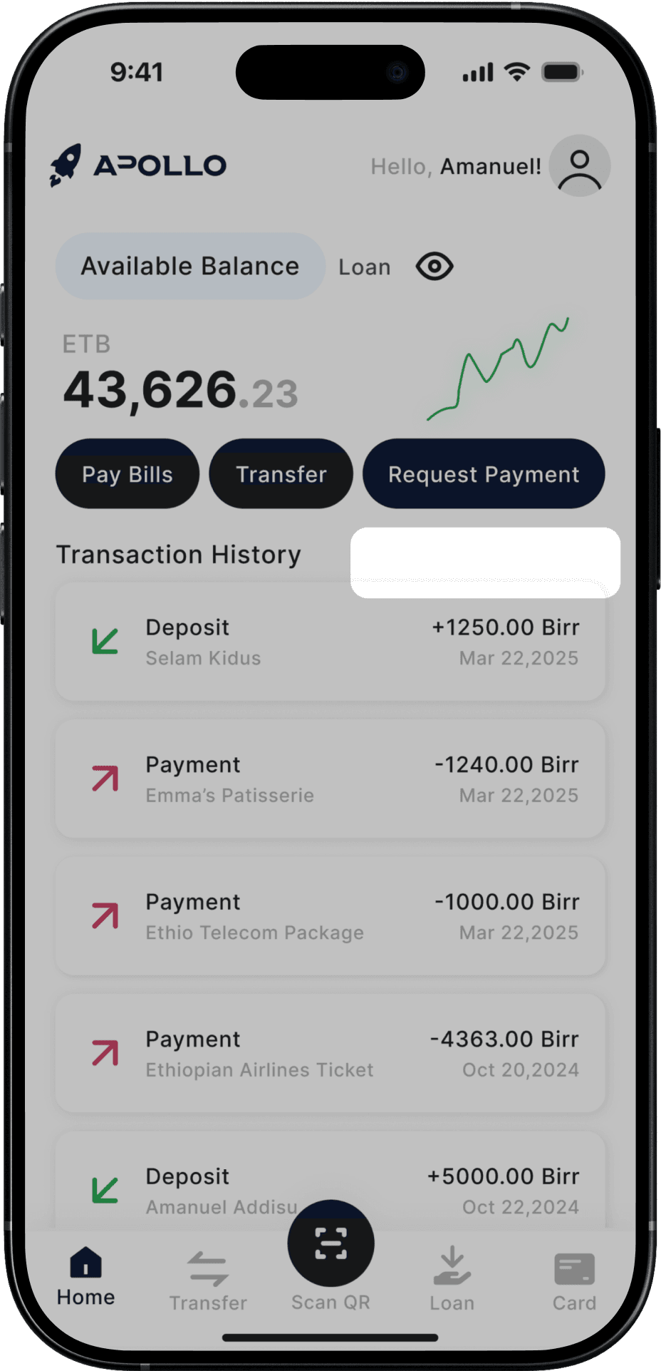
Before
To view all transactions you had to scroll down the recent transactions and click on the “View more” button. Some testers didn’t that button existed.
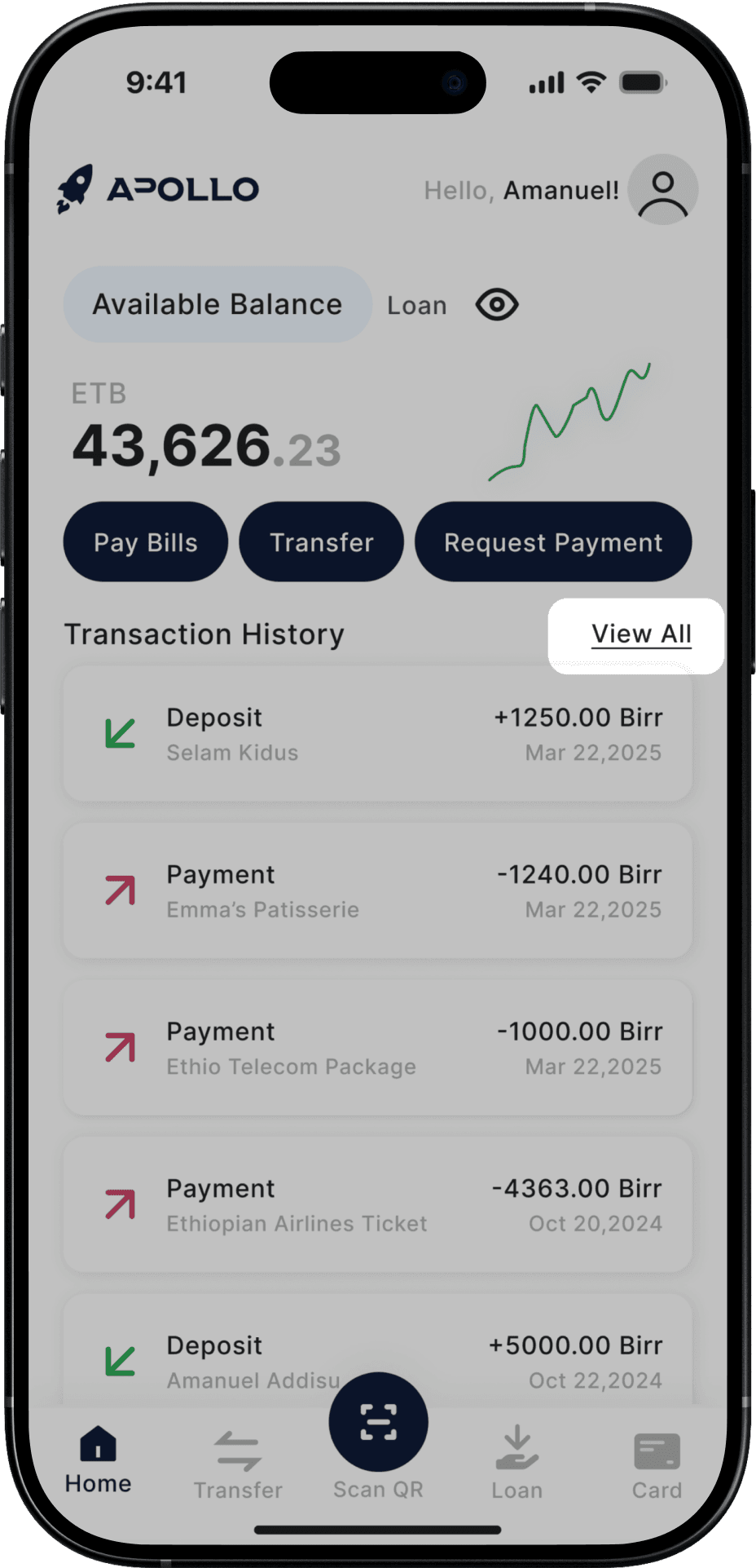
After
So to address this I also added a “View All” button at the top to improve clarity.
I created an atomic design system with molecules, atoms, and organisms. WHAT? When did this turn into a chemistry class :)

[Outcome]
Intuitive overall flow
32% increase in user ratings (3.2 to 4.2) on closed testing
[Key Learnings]
Simplification is key
Users value a quick and easy process, especially on mobile.
Iterative testing pays off
Regular testing uncovered hidden issues and ensured the design met user needs.
User Context is Everything
Understanding local, first time smartphone users was essential to making informed simplification decisions.